Building a House
Finishing & InteriorEssential
Wall Paints and Color Selection
A practical guide to choosing the right paint type, finish, and colour palette for walls, doors, and furniture without costly mistakes.
10 min read· Last updated 12 Apr 2026
Start With the Right Paint Decision
Choosing paint is not only about brand names or shade cards. The better approach is to decide in three steps: which surface you are painting, how much wear that surface will face, and what kind of finish you want in the room. Once these three decisions are clear, the shortlist becomes much smaller and more practical.
In Indian homes, this matters because not every painted surface behaves the same way. A bedroom wall in a low-traffic apartment in Pune does not need the same paint system as a kitchen wall in Mumbai, a bathroom ceiling in Kochi, or a metal grill exposed to moisture in Chennai. Paint selection should respond to use, humidity, cleaning frequency, and sunlight, not just showroom display boards.
It is also worth planning your budget early. Economy paints can work for rental units, quick refresh jobs, and rooms with low wear. Premium interior emulsions cost more, but they usually give better coverage, smoother finishing, and longer service life. That balance matters in owner-occupied homes where repainting every few years becomes expensive and disruptive.
Choose Paint by Surface, Not Just by Brand
The first rule is simple: wall paints, wood paints, and metal paints are not interchangeable. For interior walls, emulsions are the standard choice because they give a cleaner finish and work well across living rooms, bedrooms, passages, and ceilings. For wood and metal surfaces such as doors, window frames, railings, and furniture, enamel systems are still commonly used where a harder protective coat is needed.
This surface-based approach avoids one of the most common mistakes in renovation: using the same visual logic for everything. A wall needs breathability, even coverage, and a finish suited to the room. A wooden wardrobe shutter or metal gate needs a coating that can resist scratches, routine cleaning, and in some cases rusting or surface deterioration. If the substrate is wrong, even an expensive topcoat will disappoint.
Within most major paint brands, you will usually find similar product ladders even if the names differ. One range is budget-oriented and suited to basic projects. Another is mid-range with better washability and colour retention. The premium range is typically marketed for longer life, smoother finish, and better stain resistance. Instead of getting attached to label names, compare product category, finish, washability, and recommended use area.
Pick the Right Finish for Each Room
Finish changes both the look and the maintenance level of a painted surface. Matte or flat finishes have almost no shine, absorb light, and visually soften the wall. That makes them useful for ceilings, formal rooms, and surfaces where you want to reduce glare or hide minor imperfections. In a compact flat in Bengaluru or Gurugram, matte paint can make a room feel calmer, especially when the walls are not perfectly even.
Soft sheen and satin finishes sit in the middle. They reflect some light, feel more polished, and are easier to clean than matte walls. This makes them practical for living rooms, bedrooms, hallways, and entry passages where you want a refined look without a highly glossy surface. For many families, satin is the safest all-round choice because it balances appearance, durability, and ease of maintenance.
Semi-gloss and high-gloss finishes are better reserved for areas that see more dirt, splashes, or frequent wiping, such as kitchen backsides, utility-facing surfaces, doors, trims, and selected bathroom zones. They clean easily and resist staining better, but they also highlight dents, waviness, putty patches, and poor plaster lines. Textured finishes are a different category altogether and work best on one feature wall, not across the full room.
Understand Paint Life, Base Preparation, and Repainting
Paint performance depends as much on preparation as on the product itself. Even a good emulsion can fail early if the wall has loose old paint, damp patches, powdery plaster, or uneven putty work. That is why most paint systems recommend a proper sequence of surface cleaning, crack filling, putty, primer, and then finish coats. Skipping the base may reduce cost for a few weeks, but it often increases touch-up and repaint cost later.
Repainting needs special care because old surfaces may carry distemper, old enamel, washable emulsion, lime-based coatings, or patch repairs done over the years. Do not assume the new paint can go directly on top of the old one. Compatibility, sanding, primer choice, and moisture condition all matter. If the existing wall has flaking layers, chalking, or glossy old paint, direct topcoats can peel, blister, or show patchiness very quickly.
Many homeowners also confuse damp-proof paint claims with actual moisture treatment. Surface coatings can improve resistance in some situations, but they are not a substitute for repairing the root cause. In older buildings in Mumbai, Kolkata, or coastal Kerala, this distinction is especially important because trapped moisture can keep returning through masonry even after repainting.
Use Colour Selection Rules That Actually Work
Colour selection becomes easier when you stop trying to choose from a wall of tiny chips. Always ask for a larger shade card or sample sheet and compare colours in daylight. Small samples often make bold shades look harmless, but once applied across an entire wall they feel much stronger. This is why many repainting regrets start at the paint counter rather than on site.
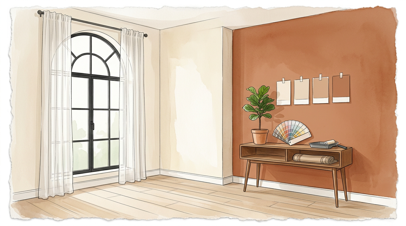
One reliable method for beginners is to stay within one colour family and build a monochromatic scheme. A practical version is to keep three walls in a lighter shade and make one wall deeper in the same family. A soft sage room with one darker olive accent wall, or three dusty blue walls with one deeper blue wall, usually looks more controlled than mixing unrelated colours. This is one of the safest ways to create visual interest without making the room feel chaotic.
If you want more contrast, use the colour wheel with discipline. Opposite colours can work, but only when one clearly leads and the other supports through smaller accents. In most Indian homes, especially apartments with tiled floors, wardrobes, curtains, and multiple vendor finishes, it is safer to keep the wall palette lighter and add stronger colour through one wall, artwork, cushions, or loose furniture. Darker shades can look elegant, but they need confidence, good lighting, and cleaner execution.
Plan Colours Around Light, Cost, and Room Function
Wall colour should respond to both room function and natural light. North- and east-facing rooms usually receive softer light and can carry cooler neutrals, muted greens, soft blues, and greys more easily. West-facing rooms in Ahmedabad, Hyderabad, or Nagpur often get harsh afternoon light, so very bright whites or intense gloss finishes can feel glaring. In such cases, warm off-whites, soft beige, muted greige, and low-sheen finishes usually age better.
Room purpose matters just as much. Bedrooms usually benefit from calm palettes and lower contrast. Living rooms can handle more variation because they are social spaces. Kitchens and utility areas need finishes that can be cleaned often. Bathrooms require moisture-aware systems and careful ventilation, not only a fashionable colour. If a room already has strong floor tiles, printed curtains, or a bold wardrobe laminate, the wall should usually stay quieter so the space does not feel overloaded.
Cost is another practical factor. In most systems, deeper and more saturated shades require stronger tinting, so they often cost more than lighter tones. That does not mean dark colours should be avoided, only that they should be used deliberately. A single accent wall is often a better financial and visual choice than coating an entire room in a very dark, premium shade.
A Simple Checklist Before You Finalise Paint
Before locking shades and products, review the room like a builder, painter, and homeowner at the same time. This avoids attractive but impractical choices and helps you communicate better with contractors, painters, and suppliers. It is especially useful during full interior work, where carpentry, lighting, curtain fabric, and paint decisions are happening in parallel.
- Confirm whether the surface is wall, wood, or metal before selecting the paint category.
- Check if the room needs matte, satin, or higher washability based on actual use.
- Inspect the wall for cracks, chalking, damp patches, or uneven plaster before finalising product range.
- Ask for large shade cards or painted samples instead of choosing from tiny chips.
- Test colours in daylight and at night under your actual lights.
- Use one deeper accent wall only if the room has enough light and visual balance.
- Keep strong patterns, stencils, or textures limited to one controlled area.
- Treat seepage, leakage, or terrace dampness before any repainting work starts.
- Verify repaint compatibility and primer requirements with the painter and product specification.
- Match wall colour with flooring, wardrobe laminates, curtains, and furniture before placing the final order.
If you want the safest possible outcome, keep the majority of the room light, use one darker related accent, and avoid overly glossy wall finishes unless cleaning is the top priority. This works well for most Indian apartments, builder floors, and independent homes because it gives flexibility for future furniture and decor changes. It also reduces the chance of the room looking dated too quickly.
For homeowners who want more personality, patterns created with masking tape, stencils, or controlled texture can add character without repainting the full room in a risky palette. The key is restraint. One wall with intention feels designed. Too many ideas in one room feel unfinished.