Building a House
Finishing & InteriorEssential
Interior Design Fundamentals
A practical guide to using design elements and principles to make any home look balanced, functional, and visually cohesive.
10 min read· Last updated 12 Apr 2026
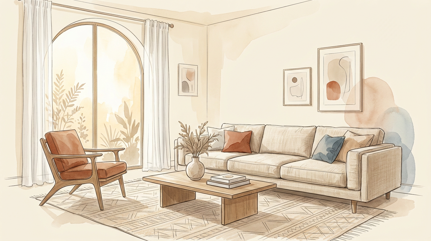
What Interior Design Fundamentals Really Mean
Interior design is not only about choosing a sofa, wall paint, or decorative lights. It is the method of shaping a space so that it feels comfortable, useful, and visually connected. In an Indian home, that means every design decision must respond to real conditions such as room size, daylight direction, storage needs, climate, and the way the family actually lives.
A good interior rarely happens by accident. It comes from understanding a few core design elements such as line, shape, space, light, color, pattern, and texture, and then applying principles like balance, contrast, rhythm, focus, and proportion. Once these basics are clear, even a compact 2BHK in Pune or a builder floor in Delhi can feel intentional instead of cluttered.
Most design mistakes happen when people buy attractive pieces one by one without checking how they work together. The result is a home with nice individual items but no visual order. Fundamentals solve that problem because they help you decide what should dominate, what should support, and what should stay neutral.
Start With Line, Shape, and Form
Line is the first visual cue in any room. Horizontal lines feel calm and grounded, so they work well in bedrooms, low seating arrangements, and relaxed family lounges. Vertical lines feel bold and make a room appear taller, which is useful in compact apartments with standard ceiling heights. Diagonal lines add energy, but too many of them can make a room feel restless rather than inviting.
Shape and form decide whether a room feels soft, sharp, playful, or formal. Organic shapes, such as curves and irregular outlines, feel natural and relaxed. Geometric shapes, such as squares, rectangles, and circles, feel structured and man-made. The best interiors do not depend on only one type. A living room with only sharp-edged furniture can feel harsh, while a room with only curves may start looking undefined.
This balance matters even more in Indian homes where different age groups share the same space. In a kid's bedroom, rounded corners and softer shapes are safer. In a contemporary Gurgaon apartment, cleaner geometric forms may suit the architecture better. The goal is not to choose one category forever, but to decide which one should lead and which one should soften the overall composition.
Use Space, Light, and Texture With Intention
Space is not empty area; it is the volume available for movement, furniture, and visual breathing room. Positive space is where objects, furniture, color blocks, or patterns draw attention. Negative space is the open or visually quiet part that keeps a room from feeling crowded. In a living room, positive space can dominate because seating, tables, and storage are necessary, but in a passage, entry foyer, or compact kitchen, negative space becomes more important because circulation matters more than display.
This is where many Indian homes go wrong. A room may be large enough, but oversized furniture, too many side pieces, or bulky storage can reduce comfort. A 10 x 12 bedroom in Mumbai or Bengaluru cannot be planned like a villa bedroom in Ahmedabad. Good design respects the dimensions first and decorates after that.
Light changes how every material and color looks, while texture decides whether the room feels rich or flat. Natural light from the north and east is generally softer and easier to work with in Indian conditions, especially in bedrooms and family spaces. Harsh west light can create glare and heat gain, while south light needs more control in summer. Artificial lighting should support the layout through ambient, task, and accent layers, and textures should be mixed carefully so that cane, wood grain, stone, boucle, laminates, and wall finishes add depth without making every surface visually noisy.
Build Better Rooms Through Color and Pattern
Color works best when it is planned, not improvised at the paint store. A useful starting point is to understand hue, tint, shade, and tone. Pure color is the base hue. Add white and it becomes lighter. Add black and it becomes deeper. Add grey and it becomes softer or muted. These variations help create richness without forcing too many unrelated colors into one room.
For most homes, four color approaches are practical. Monochromatic schemes use different tones of one color and feel calm. Complementary schemes use opposite colors and create energy, but one should clearly dominate. Analogous schemes use neighboring colors and feel more blended. Split complementary schemes offer contrast with less harshness. In Indian homes, this matters because wall color, curtains, upholstery, and loose accessories often come from different vendors and can easily lose harmony.
Pattern should support the mood of the room, not compete with it. Ethnic motifs such as paisley, ikat, or Moroccan repeats can add character to traditional or eclectic homes, while stripes, chevrons, and geometric repeats suit more casual or contemporary spaces. Floral and curved patterns feel softer, while plaid and sharper repeats feel more structured. A safe approach is to let one pattern lead and use the others in smaller doses, especially in apartments where vitrified tiles, modular storage, and false ceilings already contribute enough visual information.
Apply the Main Design Principles Without Overdoing Them
Balance is the reason a room feels settled. It can be created through symmetry or asymmetry. Symmetry is easier to see and works well in formal spaces, especially around beds, pooja backdrops, large windows, or TV walls. Asymmetry is more relaxed and often feels more refined when done well. A tall lamp can visually balance a large chair, or one large artwork can offset a cluster of smaller objects if there is a common link such as height, color, or visual weight.
Rhythm and repetition make a space feel connected. When a color, shape, finish, or detail appears again in a measured way, the room feels intentional. For example, the wood tone of a dining table may repeat in wall trims, a pendant frame, and the legs of a console. That repetition guides the eye and stops the home from looking like each corner was designed separately.
Contrast prevents monotony. If every surface, line, and finish is too similar, the room becomes predictable. Contrast can come through light and dark colors, matte and glossy finishes, curved and straight shapes, thick and thin lines, or warm and cool materials. Focus then decides where the eye should land first. That could be a window view, an accent wall, a chandelier, a bold artwork, a headboard, or a statement chair. A room does not need many focal points. One strong focal point, or at most two, is usually enough.
Respect Scale and Proportion Before Buying Furniture
Scale is about how furniture relates to the room. Proportion is about how one object relates to another. These two ideas decide whether a room looks well-planned or awkward, even when every item is expensive. A large sectional in a small Noida apartment can block movement, while tiny furniture in a spacious Hyderabad living room can make the room feel underfurnished.
Rugs are one of the easiest ways to judge proportion. In a living room, at least the front legs of the main seating should sit on the rug. If the rug is too small and floats in the middle, it weakens the entire arrangement. Under a dining table, the rug should extend enough that chairs remain on it even when pulled out. Otherwise, the setup looks incomplete and becomes uncomfortable in daily use.
Accessories also need proportion. A vase or object placed on a console should not visually overpower the table. Groupings usually work better in odd numbers such as three or five because they feel more natural. Heights should vary so the eye moves up and down instead of reading a flat line. These are small decisions, but they create the difference between styled and random.
A Simple Framework for Real Projects
Before finalising finishes, furniture, and decor, run through this checklist for each room:
- Confirm the room's exact dimensions and furniture clearances first.
- Identify the strongest natural light direction and control west or harsh south exposure where needed.
- Decide whether the room should feel calm, bold, formal, cozy, or airy before selecting shapes and colors.
- Keep a healthy balance between positive space and empty circulation space.
- Choose one dominant color family and use accent colors in limited quantity.
- Select one main focal point instead of making every wall compete for attention.
- Repeat at least one finish, color, or shape across the room to create rhythm.
- Mix textures, but leave some surfaces plain to avoid visual heaviness.
- Check rug, artwork, side tables, and accessories for proper scale.
- Review the design in daylight and at night because lighting changes the full look.
This checklist is especially useful during renovation because Indian homes often involve parallel decisions across carpentry, paint, electrical work, soft furnishings, and decor. Without a simple framework, each vendor solves only their own part, and the final house loses coherence. The easiest way to apply these rules is room by room. In a master bedroom, prioritize calm horizontal lines, soft light, controlled pattern, and enough negative space around the bed. In a living room, let one focal point lead, usually the TV wall, window view, or a statement art wall, and then support it with balance and repetition. In a kitchen, lighting, circulation, and proportion matter more than decorative layering because the room must perform well every day.
You should also adapt design principles to climate and maintenance. In humid coastal cities such as Mumbai or Kochi, some fabrics and finishes may need more care. In dusty cities, overly textured open shelving can become a maintenance burden. In rental homes, choose accents that can be changed easily, such as cushions, art, throws, and movable lighting, instead of locking the full scheme into permanent surfaces.
Finally, remember that good interiors are rarely about adding more. They are about choosing better. When line, space, light, color, texture, balance, contrast, and proportion work together, even a simple home starts to look polished. That is the real foundation of interior design, and it applies whether the project is a compact apartment, a duplex, or a full villa.